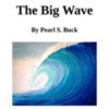
Reading Assignment: Finish reading The Big Wave


Writing Assignment: I have attached three pictures. They are the same ones we discussed in class.  I did not attach the fourth because you have it on your book.


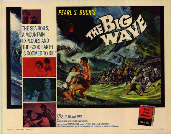
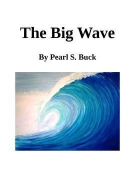
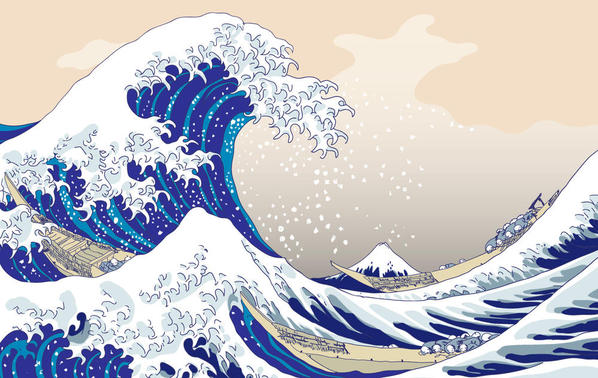
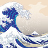
Please pick one and write a few sentences explaining why the picture you chose makes the best cover for the book The Big Wave. Keep in mind what other people said. Elvira, for instance,  liked the movie poster because it was so vivid and full of feeling. Cindy preferred the current cover because it included all the key elements of the book, the two boys, the wave, and the volcano.  Enya liked the contrast between the huge wave and the little people in the Hokusai painting (Cover 3). You might agree or disagree.  Either way thinking about how others responded will help you explain your own response both to yourself and to others. 


the-big-wave-movie-poster-1962-1020314415

big wave

Hokusai_by_gamba87

Attachments

Images (3)
  • Cover 1, poster from a movie based on the book
  • Cover 2, an earlier book cover
  • cover 3, painting by Hokusai
Last edited by Laraine
Original Post

Replies sorted oldest to newest

    I like the second picture and I hope it can be the book's cover.

    Maybe it doesn't have people and volcano. Maybe it looks too monotonous. But I like it.

    I like it because it is the only one is real picture. The ocean in the picture is very mystery and it just like an artwork. Maybe there is some people but they are behind the big wave because the wave is so big.

    I like this picture and I think this is the best cover for the book.

Very nice Mark. I think you did a good job explaining what you liked about the second picture. And you are right, it is very "mysterious."  And there might well be people hidden behind it. I am impressed as well with your use of the word "monotonous," which you used correctly.


I don't know if you did it on purpose, but this is a skilled writer's trick, using two sentences very close in style and syntax (word order) and then breaking the pattern with a very short sentence:"Maybe it doesn't have people and volcano. Maybe it looks too monotonous. But I like it."

Last edited by Laraine

Hello,Laraine,

     I like the third picture to be the cover.Because the wave in the picture is so big and the people in the picture are so small,that makes the reader to pity the people in the story and to scary with the big wave.They can understand the character in the story why they talk about "life is stronger than death"and know the wave sometimes is dangerous.Every things in the story does in the picture:the people, the volcano,the big wave.I like this picture so much.

Add Reply

Post
×
×
×
×
Link copied to your clipboard.
×